
The Perfect Color Palette for a Wedding
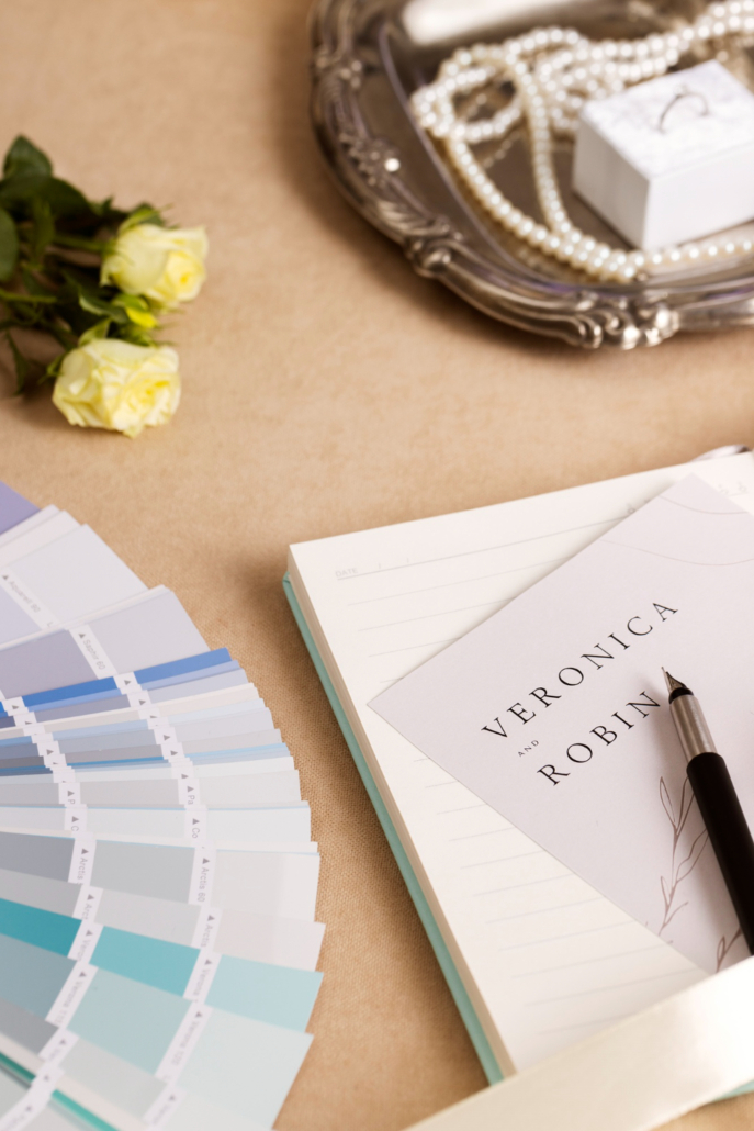
The first impression of a celebration is formed within the first few seconds. Guests can’t yet hear the music or see the ceremony, but they already sense the overall atmosphere through color.
The Exclusive 4 You team knows that professional wedding planning always begins with creating a harmonious color scheme. Well-chosen shades bring together florals, textiles, lighting, printed materials, and table settings into a single, sophisticated narrative. A poorly chosen palette can make even expensive decor look chaotic, while well-chosen shades add sophistication to any space.
Why Color Choice Is More Important Than It Seems
Most couples start their planning by browsing beautiful photos online. This is natural, but this is where the first mistake occurs. In a photo, individual flowers or decor elements catch the eye, even though the entire composition works together as a whole.
The final result is always influenced by:
- Natural and evening lighting
- The texture and density of fabrics
- The color of the furniture and flooring
- The architectural features of the venue
- The overall amount of greenery in the surroundings
From the very day the long-awaited marriage proposal is made, the couple begins to choose their own style. The main rule is to select a color palette suited to the specific venue and season, rather than simply following fleeting trends.
Why There Is No Single Universal Color Palette
Brides and grooms often ask which color is currently in fashion. In reality, it’s better to ask which shades best suit the specific venue.
Shades that look perfect in a historic hall may lose their depth on a snow-white beach by the ocean. That’s why developing a concept starts with analyzing the venue.
The Most Elegant Timeless Wedding Palettes
Classic white, ivory, and cream
These are undeniable classics. Combining several similar light shades creates depth without being overly busy. This palette looks especially sophisticated by the water, in modern architecture, or during an evening candlelit ceremony. The key lies in the contrast of fabric textures and foliage.
Champagne and Soft Gold
Warm golden, milky, and cream shades are considered a symbol of understated luxury. This combination creates a cozy atmosphere without excessive glitz. It pairs beautifully with real candles, natural linen, crystal, white roses, and orchids.
Sage Green and Pure White
Sage green remains one of the most elegant natural colors. Its main advantage lies in its versatility. It looks equally beautiful in spring, fall, at garden ceremonies, and on open terraces.
Muted Blue
A delicate shade of blue adds lightness and freshness to a space. It blends harmoniously with light wood, silver accents, and snow-white floral arrangements. For coastal venues, this palette looks as natural as possible.
The Aesthetic of Understated Luxury
This style is based on deep and sophisticated tones, including milk, dark green, graphite, deep burgundy, and champagne. There are no bright, acid-hued accents here. The focus is on luxurious materials, high-quality textures, and depth of color.
Delicate mocha and warm beige shades
Shades of coffee, cocoa, caramel, and warm beige add a special sense of coziness. They pair beautifully with natural wood, natural stone, and fresh greenery.
Common Mistakes When Choosing a Color Palette
Most often, difficulties arise not because of the color itself, but because of its improper use:
- Attempting to combine more than five different colors in a single space
- Copying photos without considering the specific features of your own location
- An unbalanced combination of cool and warm shades
- An excess of shiny gold or silver accents
- A lack of a unified style between decor, floristry, and printed materials
Professional planning begins with an analysis of the venue, the season, lighting conditions, and the couple’s personal preferences. Based on this information, a visual mood board is created. It helps the entire team work toward a common goal.
Where to Save and Where Not to
On a limited budget, it’s better to reduce the number of decorative elements than to skimp on the quality of the color scheme.
Instead of a large number of small details, it’s worth investing in:
- High-quality fresh flowers
- Beautiful linens and tablecloths
- Professional artistic lighting
- Plenty of real candles
- Stylish table settings
Also, instead of a lavish second day of celebration, you can organize a cozy romantic picnic for your loved ones in natural pastel tones, which will significantly conserve resources.
How to choose a color palette that won’t go out of style over the years
Wedding photos stay with the family for a lifetime. That’s exactly why you should choose colors that will still look fresh and relevant decades from now. Natural neutral shades white, ivory, champagne, muted green, and warm beige stand the test of time best. They aren’t tied to fleeting trends and always look elegant.
The wedding color palette sets the mood for the event, highlights the venue’s best features, and brings all the details of the celebration together into a cohesive whole. The best color schemes don’t aim to draw attention with excessive brightness; instead, they create a sense of calm, lightness, and sophistication.
FAQ: Answers to Common Questions
What wedding color palette is considered the most versatile?
White, ivory, cream, and champagne are considered the most versatile and suit virtually any venue.
How many colors should a wedding color palette have?
Ideally, use three to five shades that gently complement each other.
Should you focus solely on popular trends?
No, because trends change quickly. The color palette should, above all, harmonize with the venue and appeal to the couple themselves.
What colors work best for a beach wedding?
Light neutral shades, muted blue, sand, and sage green perfectly complement a seaside setting.
Can you combine classic elements with modern trends?
Yes, a classic neutral base is perfectly complemented by a few modern accents without overwhelming the space.
Does the chosen color palette affect the overall budget?
Yes, well-chosen colors allow you to achieve a luxurious look even with fewer decorations.
When should you decide on a color scheme?
You should decide on the color palette at the very beginning of your planning so you can immediately select flowers, decor, and attire that all match in style.

